An increase in business led SOTI India to expand their workforce on an urgent and acute scale. Previously operating from a considerably smaller office seating 60, they felt the urgent need of an expansion. A Canada based software solutions consultancy, they had firmly set their foot in the country within two years and were now set to move into a 51,000 sq.ft. space from a mere 8,000 previously, which was designed by us. We dare say we did an honest justice with their initial office at Vatika Business Park, Gurgaon. A turnkey assignment executed smoothly within the scheduled dates reinstated their faith in us, and we were handed over the keys to the second floor of the Bestech Towers, sitting amidst the corporate jungle of Gurugram. A turnkey contract to finish the entire space within a few crisp months was the deal. Again.
A raw bare shell site sat in front of us, waiting to be born.
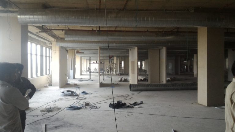
The bare sight as it was before construction.
This being an offshore enterprise, no first-hand interactions were possible during the entire period with the client. There were ample conversations and brainstorming sessions, but it was all online; video conferences came to the rescue. An entire design developed, and executed after multiple changes done through the internet was something we had not done till then. Aiding in this process, the time zone of Canada and India was of major help.
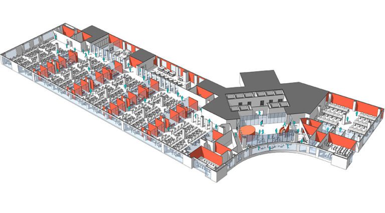
3D Axonometric view showing the spatial layout of the office.
The client brief called for an efficient and streamlined workspace accommodating 450 employees. The site presented the north advantage, and diffused natural light was in abundance. Service facilities were pre-placed at the back, reserving the more valued front areas for prime usage. We decided to upgrade the client requirement to provide a collaborative and egalitarian workspace, one that combines responsibilities with workplace fun. The final decision was to fabricate a sustainable design integrating workspaces with collaborative areas for constructive discussions along the north face so as to utilise the natural lighting, and additional services like recreation areas and circulation laid along the dead wall to maximize resource optimisation.
As a practice that is deeply invested in the mental and physical well-being of its users, we guided the clients on how to make the office more employee friendly, healthy and engaging. Believing in the mantra, ‘educate your client as you go’, we prioritized the necessity of a good space that combines aesthetics with functionality, giving back much more than what was asked.
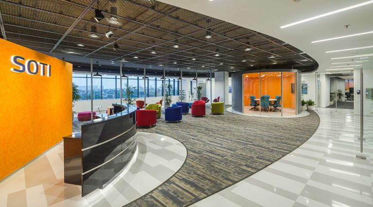
Reception area
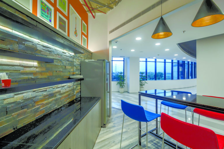
Cafe Nook
The office has been planned to maximize natural light and views surrounding the building. The spaces with high usage have been placed around zones where maximum natural daylight is available. The existing floor plate was awkwardly split into two separate zones. The challenge was overcome by creating a central reception and introducing a free-flowing corridor around it. The corridor not only connects the two disjointed spaces but also enhances the reception as an island. A casual lounge and a small Café were also further carved out along the corridor to create an exciting visual experience around the island. The lounge has been visually integrated with the reception to create a larger-than-life reception. The main work hall has been divided into separate zones by placing enclosed intermediate bays of Office cabins, meeting rooms and collaborative spaces. This not only allows natural light to penetrate deep into the office but also ensures that these facilities are near the general workstations.
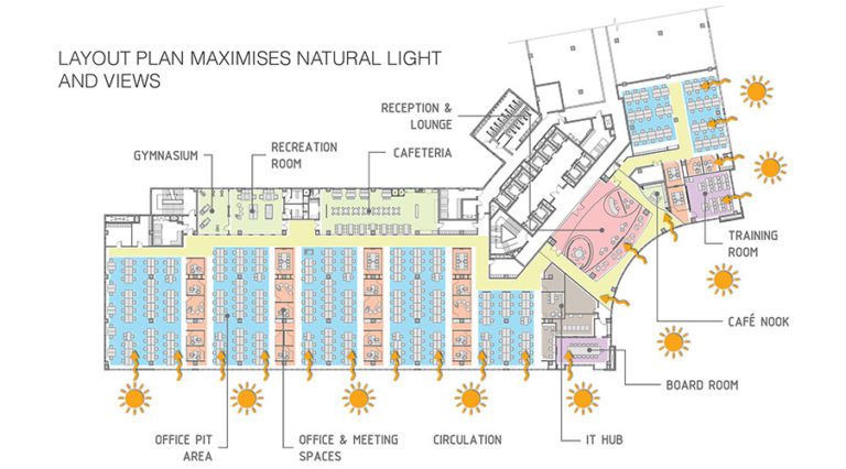
Schematic diagram showing natural light penetration in the space.
“Workspace for Innovation” has been the driving force behind the overall design evolution. Collaboration is a great way of generating ideas. This has been reinforced by ensuring a good mix of collaborative spaces and break out areas throughout the office. The aesthetics of the overall office allows exposure and openness to new experiences and stimulation. The built environment reflects not only the seriousness of a workspace but also signals to potential clients and employees – the innovative culture of the company.
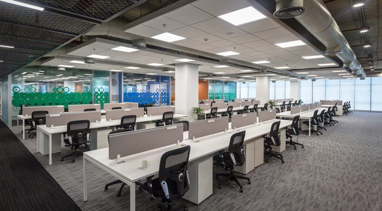
Workstation pits interspaced by collaborative cubicles.
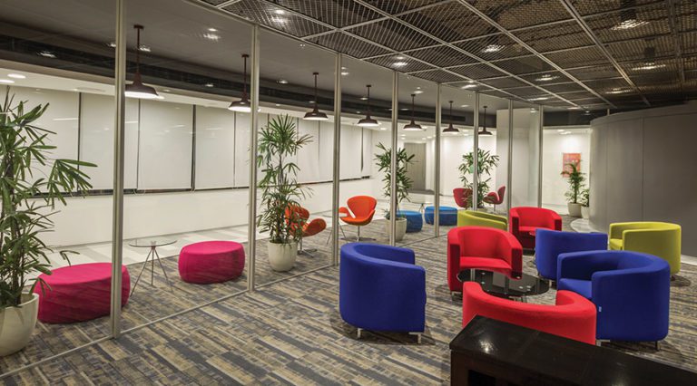
Each space offer a lot of variety in terms of their design and material usage. One enters the reception only to be awed by the vibrant burst of colours- the predominant yellow expresses freedom, and the colourful selection of seating add to the playfulness. It has been contrasted between a dynamic stone pattern, vibrant colours and rustic finishes to enhance the island affect. A small cubicle space richly adorned in bold yellow sits just across the reception and serves to be a meeting space. The Cafe Nook sits across, serving both the employees and visitors. The main workspace is interspaced by rows of personal workstations, collaborative discussion cubicles and meeting rooms. This has been done so as to seamlessly integrate personal assignments with larger team objectives- a space that simultaneously integrates discussion sessions with individual job roles is bound to produce work that has a better qualitative value.
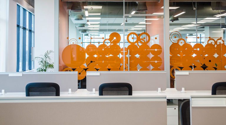
Colourful vinyl stickers ensure optimum visibility to the discussion cubicles.
A wide variety of colours has been introduced to alleviate the in-house experience. Punching it with the overall theme of white and grey results in a space that produces points of attention, a trait that has been found effective in maintaining focus amongst employees. The collaborative cubicles are made of glass, with specially designed coloured vinyl stickers ensuring optimum level of visibility.
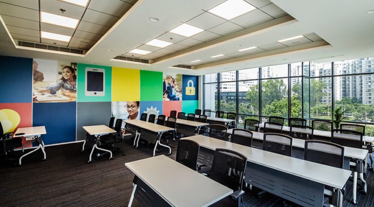
Training Room
The training room features a high, cove false ceiling with the hot wall being composed of a collage of colourful boxes, workspace images and signage. This provides the space with a keen sense of motivation.
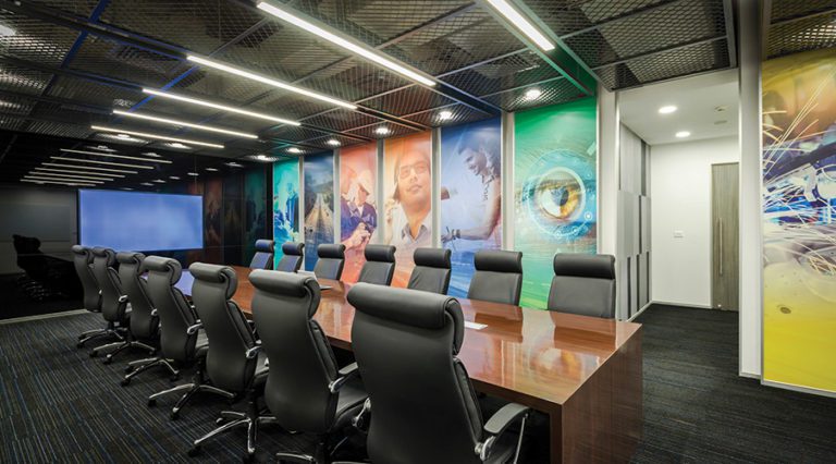
Board Room
The primary board room features an elegant meeting room furniture set sitting in front of the display. Multiple display panels overplayed with different colours keep the merriment in a space which will frequent meetings and serious professional dealings.
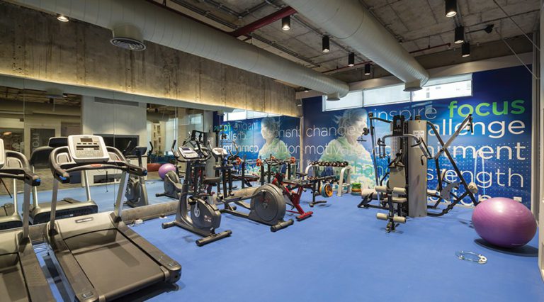
Gymnasium Space
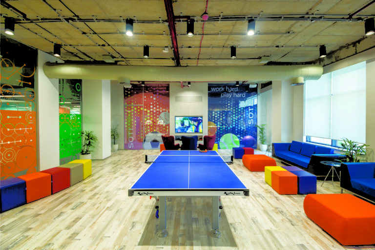
Recreation Space having a table tennis court.
Sitting right opposite to the work space are the gym and the canteen. The gym consists of a rectangular space with a glass front, ensuring visual connectivity. The matte finish of the blue floor prepares one for an energetic stint, ensuring that the tempo always runs high. The recreation room contains of multiple casual relaxation spaces along with a centrally placed table tennis court.
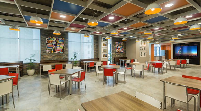
The Canteen space is a burst of colours.
The canteen is perhaps the most colourful space- the ceiling intelligently combines colour clad modular panels with a bare finish concrete ceiling, producing a blank-chequered colourful visual that is interesting to look at.
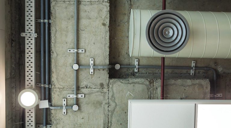
Extreme care has been taken in laying out the servis=ces to enhance aesthetic sensibility.
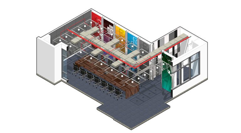
However, the highlight of the entire space will be the design of the ceiling. A previous experience with false ceilings led the clients to opt for an open-ceiling layout that provides the space with sufficient height. The critical challenge of laying the service lines aesthetically in an open-ceiling design was solved by powder-marking the lines on the concrete ceiling, followed by carefully laying the pipelines, ducts and conduits geometrically to provide an aesthetic appeal.
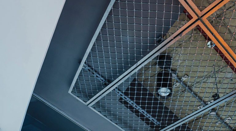
Customised steel mesh holds the services together, providing the ceiling with a sense of playfulness.
Fixtures and fittings used were chosen to compliment the exposed concrete of the ceiling. This was then covered with customised metal mesh which was attached in square grids. The unique combination of the mesh and modular ceiling panels along with visible service lines accentuated the aesthetic appeal of the Reception space as well as the board room.
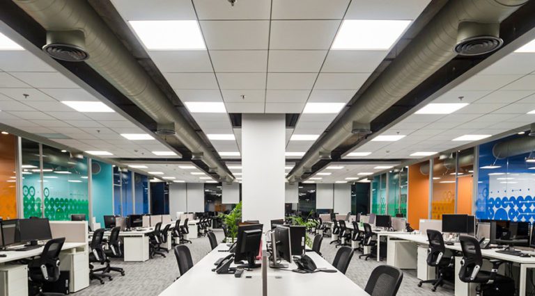
Modular ceilings ensure focused lights above all workstations.
Demand of focussed illumination led us to employ Armstrong ceiling grids that are installed above workstations. One light panel over each table was installed with a fully customisable ceiling arrangement, keeping future layout mobility active. Entirely executed on-site by a team of expert installer, the result was more than what we expected. An intelligent combination of modular panels sat on the backdrop of a grey ceiling interspaced with service ducts secured by a metallic mesh. The raw industrial appeal of this almost personifies the space, giving it a denim that would have been hard to achieve otherwise.
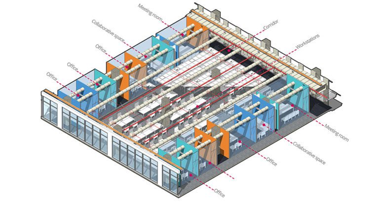
Diagram illustrating service lines laid atop workstations.
In the architect’s words,
“Everything was straight and crisp, and it was very difficult to get this done in the space. The building already had an existing service grid and modifying it for one single floor involved a marginally large change. Getting it approved by the building administration within the initial months of the project was a task, one of the most critical challenges with SOTI.”
The boardroom showing services laid atop.
Extensive care has been taken to ensure that the design maintains green design norms and is environmentally responsible. Layout has been planned to maximise natural lighting thereby reduce artificial load. All regularly occupied spaces have direct line of sight to the external glazing. BMS controlled Smart HVAC systems reduce energy loads. All paints comply with required low-VOC standards. No use of CFC based refrigerants have been done in the HVAC systems. Carpets used complies with CRI Green Label Plus program. Composite wood products and laminates do not contain added urea-formaldehyde.
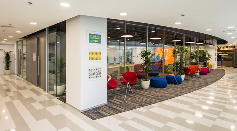
A glimpse of the final space from the corridor.
Exactly five months later, we handed over the keys to the finished office. Doors unfolded and our clients walked in into the finished space for the first time since we were awarded the project. The baby was born, and we beamed in pride as we watched them having a look, deep in admiration.
Design after all, is a product of perseverance, a labour of love. Our love.
Till the next time.
Team Basics.

